

I ran a brand I’ve used for five years through our new listing grader. It tied with its own knockoff.
We built a tool that grades an Amazon listing against our own library of 1,000+ shopper tests. I pointed it at a brand I love, put its closest lookalike beside it, and rebuilt the listing in the order

Last month, I went full nerd and did something I’d been wanting to do for years. I used Claude to analyze 900+ PickFu split testing polls (now 1,000+) from 34K (now 36K+) respondents across the 850+ eCommerce brands we’ve worked with. The result was a database that lets me look up trends, spot patterns, and answer almost any question about a client’s creative before we even start designing. This has reframed how my team and I make every creative decision and I’m sharing all of it here in Design Proof. Twice a week: data-backed creative insights to help you convert better on Amazon and eCommerce.
What we built, and why
For years our mini audit has been a manual thing. A strategist spends up to two days on one listing: research it, research the competitors, write up every section, record a 20 minute Loom video walking through it. It’s the single most effective thing we do to show a brand what’s actually wrong, and it doesn’t scale even slightly.
So we built the tool version of our mini audit. It scrapes a live listing, runs every image through Claude vision, tags what it sees in the exact same checklist we use in our buy now method, and then matches the listing against our library of more than 1,000 real shopper split tests from 36,000 respondents.
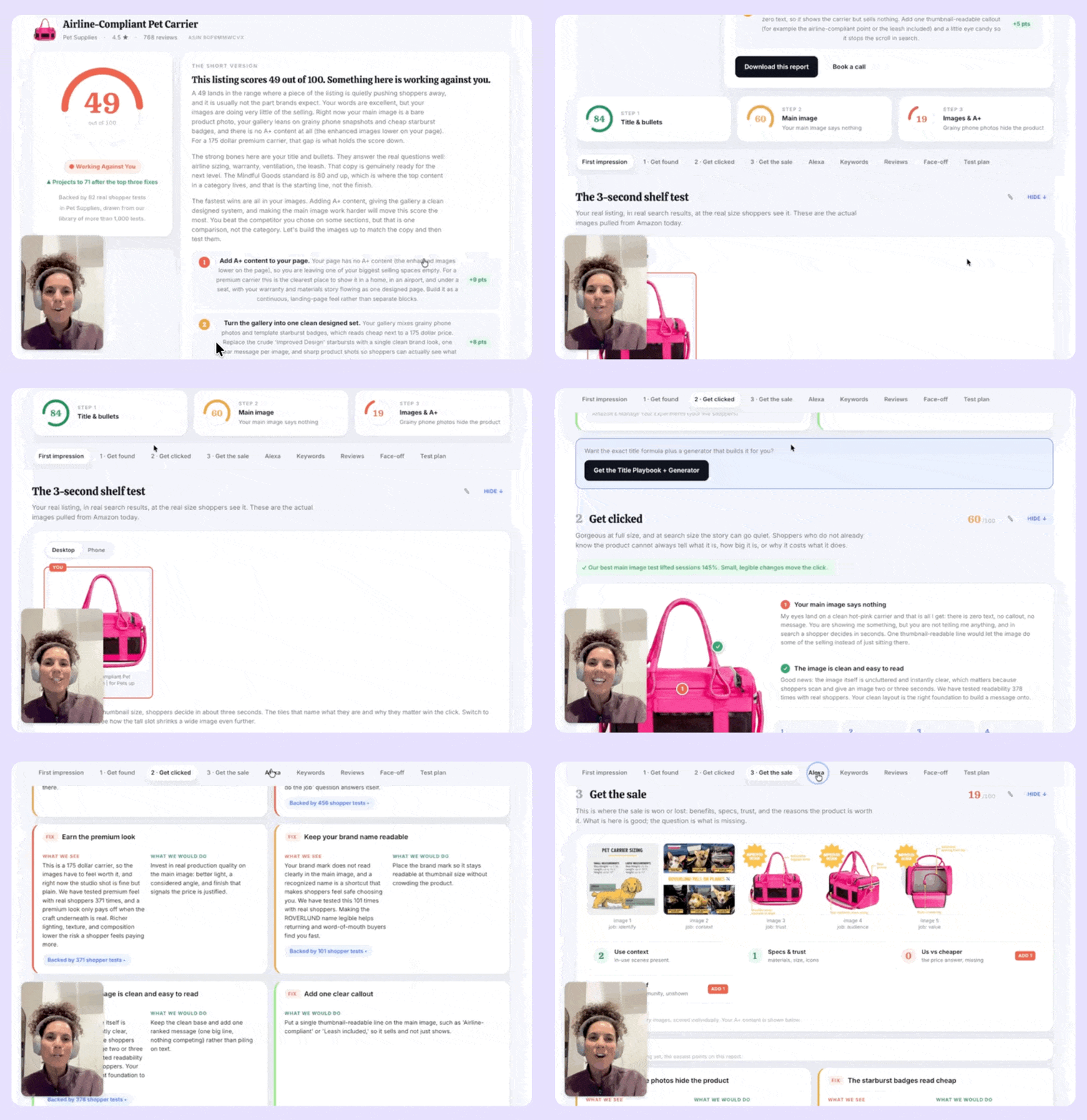
That last part is the whole point. Most listing graders are superficial at best, they check whether you have six images and a keyword in your title.
Ours asks a different question: does this listing look like the ones that actually won when we put them in front of real shoppers?
The buy now score it generates, come from code so the same listing scores the same way every time. The judgment on design quality comes from vision, held against the standard we hold our own client work to. And it’s built to be honest rather than flattering, which means it will tell you your listing is a 49.
I know that, because I ran it on my dog’s favorite brand, Roverlund. They have an impressive Shopify site but their Amazon listing falls short on almost every metric that matters.
The listing
I’ve been using the same dog carrier for about five years. Bought it when I moved to Peru and needed to fly my dog back to the States. Paid somewhere around $200 to $300, then paid again to ship it to Lima. My pup, Piggy Smalls, uses it regularly. It’s basically, his car seat now.
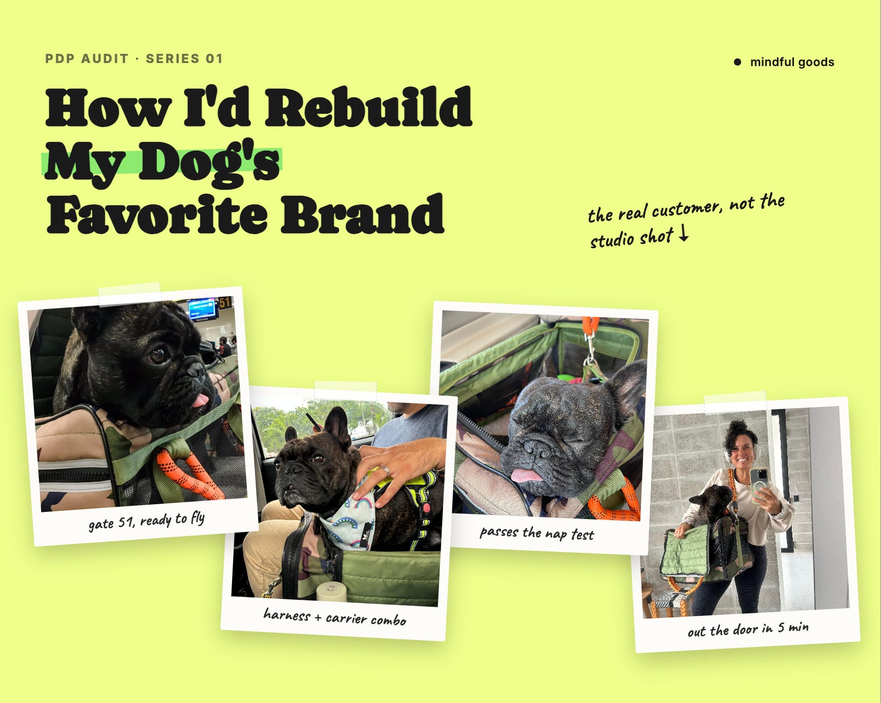
The brand’s own website is genuinely lovely, the photography hooked me instantly. Media mentions, reviews, UGC, real Instagram presence, award-winning. All the components we use to build strong Amazon listings. Their listing also has 4.5 stars and 768 reviews at $174.99, that’s a strong start.
It scored 49 out of 100. Translation: Working Against You.
And then I did the thing that actually stung. I put its closest lookalike on the shelf beside it, the cheaper near-identical dupe that shows up in the same search.
The lookalike also scored 49.
Same score. Roverlund is the original, award-winning, five years of loyal customers. The other is a copycat aka dupe. On the page where the buying decision happens, a shopper has no way to tell them apart, and our grader couldn’t either.
The single biggest reason: the copy has A+ content. Roverlund doesn’t.
The part I didn’t expect
Here’s what I assumed I’d find and what the tool actually found.
I assumed the copy would be the weak link, because that’s what usually happens when a DTC brand lands on Amazon. Great design instincts, no idea how Amazon search works.
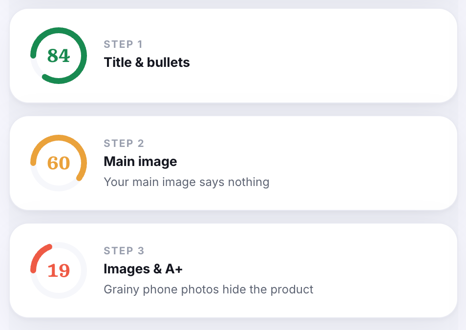
Their words scored 84. That’s the best thing on the listing by a distance. The title leads with airline compliance, names the included leash, states the 20lb limit. The bullets are benefit-led with real specifics. Somebody who knew what they were doing wrote those.
Their images scored 19.
That’s the inverse of what founders expect, and it’s the most common pattern I see. The brand that obsesses over design on its own site ships the least designed thing on Amazon, because the two platforms reward opposite instincts and nobody tells you that.
Our goal for client work is 75 and up. That’s where the top content in a category lives, and we treat it as the starting line, not the finish.
🔒 Now Let’s Get To The Good Stuff
Upgrading to paid is like getting the version of my brain that isn’t filtered for a general audience. Less than one Starbucks order per month, and you get the strategy I charge clients real money for, broken down so you can use it yourself.
Below the paywall:
The full rebuild in the order I’d do it, with what each fix is worth in points
Where our own tool and our own shopper panel flatly disagreed about one image, and which one I think is right
The review that shows a happy customer who almost didn’t buy
A feature this listing has that a top review publicly says it doesn’t have
The search real estate, two words missing from the title
How to get us to run this on your listing
