

The most lopsided split test in our database.
Here's what it proves about every main image you'll ever create.

A note before we get into it.
It’s late Tuesday — later than I planned to hit send on this first newsletter. The honest reason: I’ve been in the weeds with my team all evening, troubleshooting a stubborn main image for one of our clients. We’ve been heads down trying to build something that’s going to outperform what they currently have as a bestseller in the beauty category. It’s not an easy thing to do, but it’s definitely a challenge I love to take on.
As it turns out, this is exactly what this first post is about.
We’re kicking off with the story of one of the most lopsided split tests we’ve ever run on a main image. It happened within the last couple of months, and it’s been stuck in my head ever since.
I’m going to walk you through what made it work — and then show you how to apply it. By the end of this post you’ll have a way of thinking about main images that can genuinely change your results in split testing, plus a prompt you can customize for your own product to start generating concepts that could outperform your competitors on Amazon immediately.
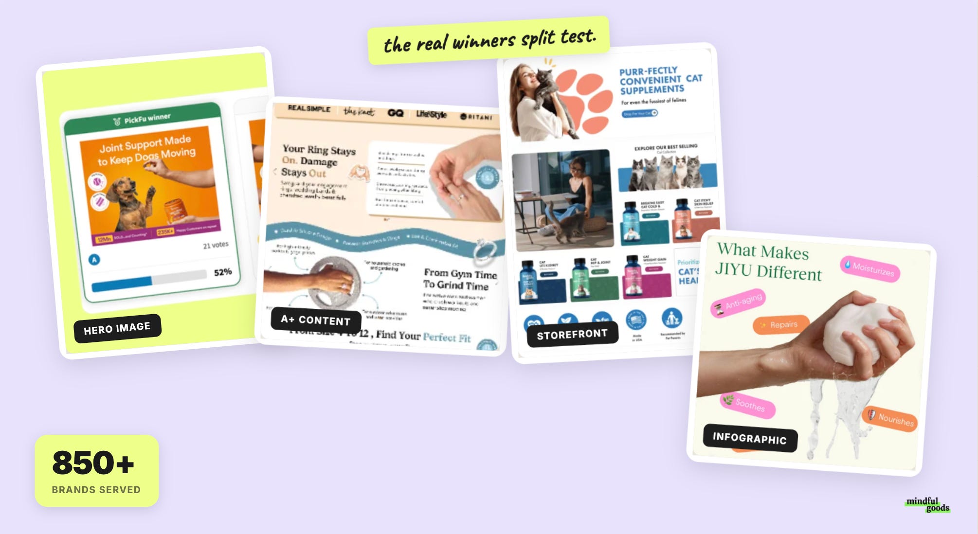
And about Design Proof, this is an endevour I’ve wanted to launch for a long time. The data has been building since 2018 — 876 consumer polls (and growing each day), 34,273 Amazon Prime respondents — and most of what we were learning stayed inside our team.
What changed is AI. We can now analyze that database at a scale that wasn’t possible before, and what we’re seeing is genuinely too much to keep to ourselves. This newsletter is where I share it: clearly, practically, twice a week.
And an insane side note on how this started: Sunday night I announced on LinkedIn that I was going to launch a Substack. Before I had even finished building my profile, within 30 minutes, I had my first paid subscriber, Max.
He left me the kindest note, saying he’d learned so much from my LinkedIn posts over the years and was excited to learn even more here.
Max, thank you. That note is the reason I’m sitting here finishing this at 11:57pm instead of calling it a night.
And to my surprise, I logged in tonight to see a total of 7 of you paid subscribers that have supported this little adventure before I even published a single post. 🤯🤯 🤯
In seven years of running consumer split tests, the result I keep coming back to isn’t from a supplement brand or a skincare line or a wellness product.
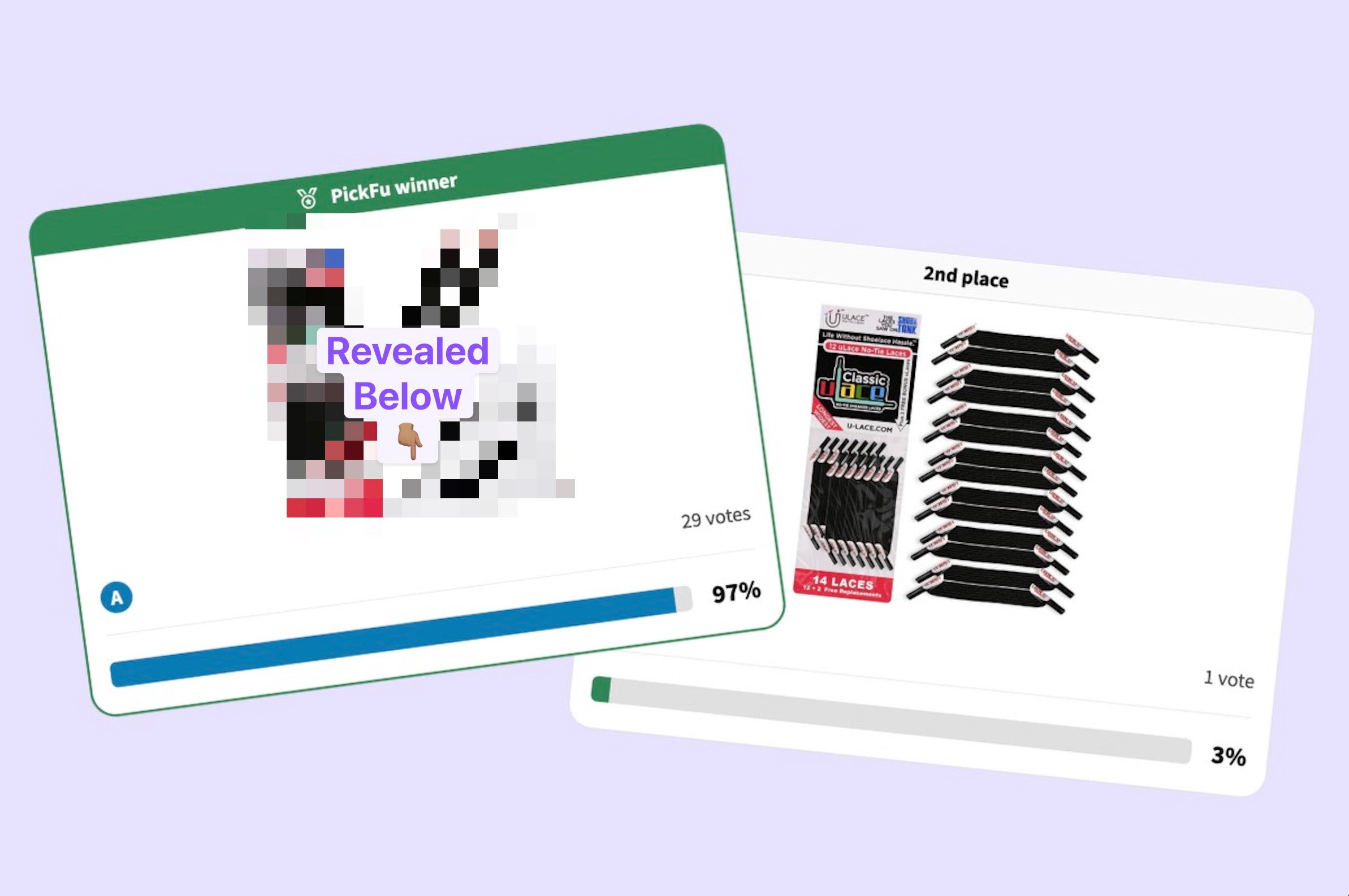
It’s a shoelace listing that we ran rather recently.
Poll #815. Thirty respondents. Two versions of the same product. The vote came back 29-1.
Tool: We use PickFu poll to run polls and target Amazon Prime shoppers, this is a pre-testing step before anything goes live to Amazon. Use my pickfu link for a discount.
Here’s what the two images showed.
Option B (the client’s original image) was fine — the shoelaces arranged in an organized display, multiple laces fanned out, laid flat showing multiple laces with the packaging. If you asked a photographer to make a shoelace shot look good, this is what they’d produce.
One thing worth knowing about these particular laces: they’re unusual. They’re no-tie laces, which means they are short and flat — not the long, round laces most people picture when they search the category. Looking at Option B in isolation, I can imagine a shopper pausing and thinking, wait, what even is this? The display shot showed what the product looked like. What it couldn’t quite answer was what the product actually was especially if you’ve never even heard of a no-tie shoe lace.
Option A (our mockup design) showed the same laces installed on an actual shoe.
Twenty-nine out of thirty respondents chose it. those results are far more rare than you think. And reading through the comments, almost everyone said some version of the same thing: “Seeing them on a shoe makes it click.”
That phrase — “makes it click” — is the one that stayed with me. It’s not just about preference. It’s about comprehension. The in-context image did something the display shot couldn’t: it helped people understand what they were even looking at.
Why this margin keeps showing up
What I’ve noticed across nearly eight years of consumer polls is a gap that’s easy to describe but hard to shake. Brands build their main images to show a product at its best — the materials, the craftsmanship, the visual appeal.
But most shoppers aren’t evaluating any of that when they’re scanning a search results page. They’re trying to answer one very specific question: will this actually work for what I need?
The image that answers that question most directly is almost always the one that gets the click.
This shows up consistently across our database of 876 polls and 34,273 respondents. It’s not that the beautiful image is doing anything wrong — it’s that it’s answering a different question than the one the shopper is asking.
What this means for your listing
Look at your main image and ask: does this show my product existing beautifully, or does this show my product doing the thing it’s supposed to do?
If you can’t tell from the main image what the product accomplishes in the real world, you’re showing Option B.
Even when the photography is genuinely better — more polished, more controlled, more intentional. It still tends to lose to the version that shows the product in-use.
🔒 Psst — The Good Stuff Is Below
Upgrading to paid is like getting the version of my brain that isn't filtered for a general audience. Less than one Starbucks order per week, and you get the strategy I charge clients real money for — broken down so you can use it yourself.
The complete MindfulGoods main image split testing process.
Includes the actual 29-1 poll full visual.
Examples from our best-performing main images
An AI prompt generator you can run on your own product today.
