
They thought his couscous was a milk

Last month, I went full nerd and did something I’d been wanting to do for years. I used Claude to analyze 900+ PickFu split testing polls (now 1038+) from 34K (now 36K) respondents across the 850+ eCommerce brands we’ve worked with. The result was a database that lets me look up trends, spot patterns, and answer almost any question about a client’s creative before we even start designing. This has reframed how my team and I make every creative decision and I’m sharing all of it here in Design Proof. Twice a week: data-backed creative insights to help you convert better on Amazon and eCommerce.
A founder I follow just posted his packaging before-and-after, and it’s one of the cleanest examples of “leveling up” I’ve seen in a while. The brand is Boostcous, a gluten-free, protein-packed couscous. (Great name. I found them on TikTok months ago through the founder’s storytelling series, where he shared the misses alongside the wins, and I’ve been rooting for them since.) He put the old box next to the new one and asked LinkedIn what they thought.
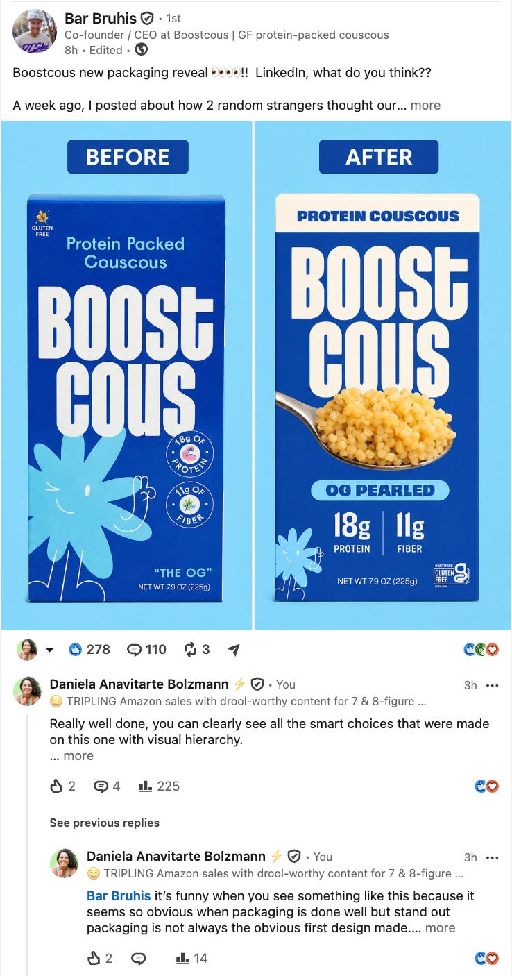
Here’s the detail that makes this perfect. The founder, Bar, said the old packaging sold over 150,000 boxes, so it clearly worked for their launch and validation period.
But he also mentioned that a couple of people thought his couscous boxes were an alternative milk - that’s a packaging fail. The box was cute, and it didn’t tell you what was actually inside.
Now look at what the refresh did:
“Protein Couscous” went right up top, so you know what it is immediately.
The protein number got made huge. “18g protein, 11g fiber” now reads instantly, where before it was tucked into small badges near the bottom.
The gluten-free certification moved to the front of the pack.
The word count came way down, and somehow you can read *more* of what matters, because the important things got bigger instead of competing with everything else.
Biggest of all: they put a big spoonful of the actual cooked couscous right on the box.
That last one is the whole point of this post. Bar’s own words for it: “Actual product on the box (crazy concept, I know).”
On a physical store shelf, that spoon shot helps. On the digital shelf, it’s EVERYTHING. Its the literal difference between getting the click and losing it.
Here’s why: online, a shopper can’t pick up your box, can’t read the fine print, and definitely can’t taste your product. So the next best thing, the only thing that answers “what even is this?” is *seeing* it.
If your packaging doesn’t show the product, and the competitor next to you in search does, most shoppers are going to click the one they can actually see.
Protip: showing the product is the bare minimum imo, but one step better is making it drool-worthy. If customer can’t taste it or smell it, make them drool when they look at it.
We’ve tested this exactly, for hundreds of CPG food and beverage brands. One worth mentioning for a snack bar brand called Yes Bar, we ran the version showing the unwrapped bars against a version that only showed packaging. Showing the actual product won with 77% of the vote. Not a close race.
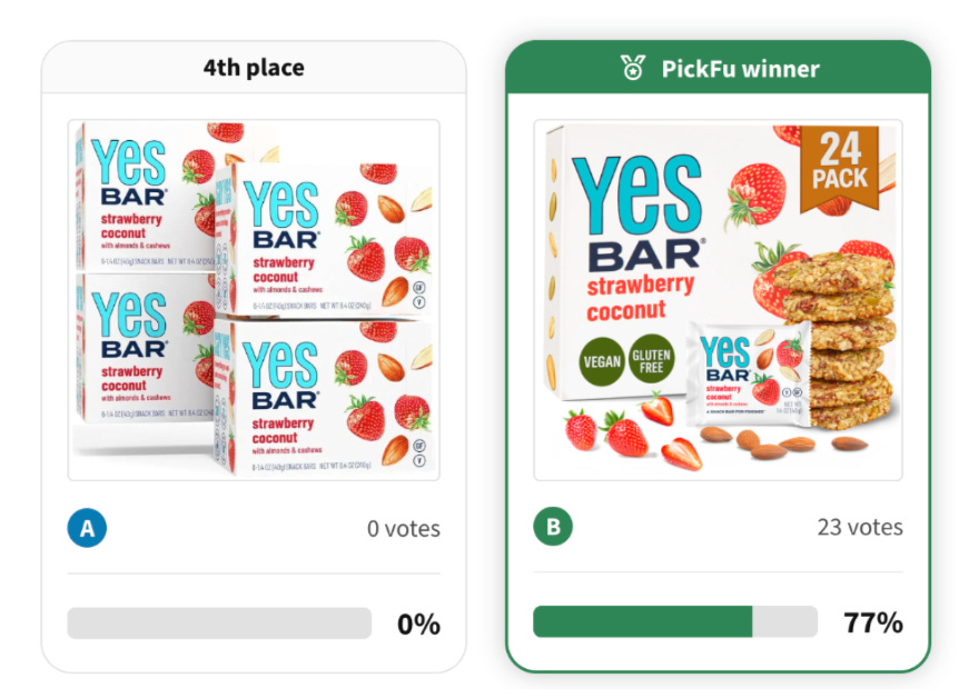
In that category, hiding the product is basically disqualifying. The bright color helps too. Boostcous kept a bold blue that’s going to pop off Amazon’s required white background instead of getting lost in the grid. But the color is the assist.
The product shot is the goal. So if you’re a founder staring at your own packaging right now, the first question isn’t “is it pretty.” It’s “can someone tell what this is, and see the actual product, from a thumbnail on their phone.” If the answer is no, that’s the first fix, before you spend a dollar on anything fancier.
Which brings me to who I send founders to when they’re earlier in this journey than we can help with…
Meet one of our featured partners:
Alli Ball (Food Biz Wiz)
When a brand isn’t ready to work with us yet, one of the people I point them to is Alli Ball. She’s a former retail buyer turned wholesale consultant, and she’s helped 3,500 founders generate over $1B in sales.
Her whole specialty is getting brands retail ready: understanding everything that has to be true, on the shelf and on the digital shelf, before you’re in a buyer conversation.
Honestly, better to learn those lessons with Alli up front than to have the gaps cost you sales and momentum down the road.
👉🏽She’s running a four-week live workshop called Sales Bad-A$$ to help founders get genuinely confident about selling, running July 21 through August 14.

If you make a packaged product (food, bev, pet, wellness, beauty, or home goods), it’s worth a look. Join by Tuesday, July 21
There’s a bigger lesson underneath the Boostcous refresh, and it’s the thing I actually want you to take away.
Great packaging is almost never the first design a founder makes. It’s the third, or the fifth.
What you’re looking at in that before-and-after isn’t “bad vs good.” It’s “good enough” growing into “great.” And knowing the difference between those two stages, and which one you actually need right now, is one of the most useful things a founder can learn.
I’ll break that down below: the three moments brands come to us to level up (and how to tell which one you’re in), the 80/20 rule I use to decide when to fix packaging versus when to just get to market, and the exact short list I give a brand before they invest in creative.
🔒 Now Let’s Get To The Good Stuff
Upgrading to paid is like getting the version of my brain that isn’t filtered for a general audience. Less than one Starbucks order per month, and you get the strategy I charge clients real money for — broken down so you can use it yourself.
Below the paywall:
The step-ladder framework for iterating your brand over time
The three moments brands come to us to level up (ezmilk, Yes Bar, and Tosi
The real tests and before-and-afters behind them, including the packaging that got rejected by 92% of shoppers)
BONUS: a copy-paste Claude prompt that scores whether your packaging shows the product.
Subscribe to unlock.
